In the days of film you made the decision of whether to shoot in color or black and white when you bought the film. As such, people often had a vision of what they wanted to shoot ahead of time, and chose their film accordingly. People also made the decision for other reasons. In my case, black and white film was cheaper, and if you wanted to develop (and enlarge) your film yourself, black and white was much easier. When I was in high school and I bought a used enlarger with my friend Dennis, we shot almost exclusively black and white for that reason and black and white became my default choice. We shot a lot of double exposures and long exposures and random scenes, so black and white was generally appropriate. However, when at 20 I did an outdoor education internship in the fall in Vermont and naturally brought a bunch of black and white film with me, I realized it is not always the right choice. I ended up with a bunch of black and white photos of the lush, tree covered hills of what is probably the most famous state in the U.S. for fall colors. Oops.
After moving away for college, I gave up developing and enlarging my own prints, and started buying more color film. I discovered the warm tones of Velvia and the richness of Sensia slide film. I became transfixed with color and when I went digital years later, color became the default. I bought my first digital camera shortly before my daughter was born, and with her entrance into my life, my focus shifted from creative photography and landscapes to shooting people. I became obsessed with editing, recalling my old days in the darkroom, and focused on trying to achieve the feel of color film, and to get natural skin tones. At first I used GIMP for all my editing. GIMP is a free and powerful editing software, but takes a lot of time to learn. I did occasionally convert images to black and white, but I often wasn't very pleased with the results. Later, after switching to Lightroom, and buying Silver FX as an extension, I rediscovered my love of black and white, and the possibilities afforded by playing with tone, contrast and detail. These days, there are an overwhelming number of photos taken and uploaded daily, mostly from smart phones, to social media sites like Instagram. These programs make it easy to achieve a variety of styles with a tap on the screen, and I notice a lot more people converting to black and white (or alternately, garishly colorful HDR). This black and white craze seems like a way to inform the viewer that a photo is "artsy." It reminds us of the days of film, perhaps, when we took far fewer photos, and put more thought into the ones we took. It suggests purity and profundity. But, for me, it is not right for all situations. These days, color is still my default when editing photos, unless I go out for a shoot with the intent of converting to black and white. Then, in Lightroom, if I notice that the color is not really adding anything to the photo in terms of contrast, or drawing the eye to a point of interest, I will try black and white. I also resort to black and white when I am trying to edit a photo that was shot in artificial light, or with various lighting sources, and I can't manage to get normal looking skin tones. Black and white can do a great job in reducing glaring color inconsistencies to gradations of grey that are pleasing to the eye.
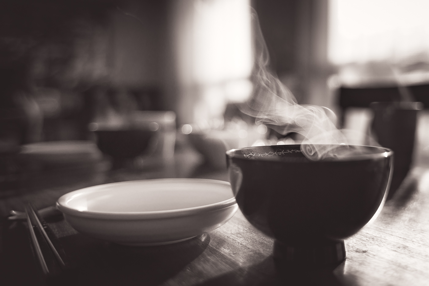
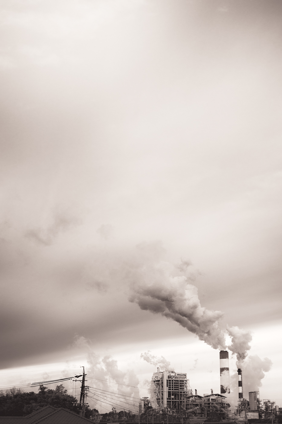
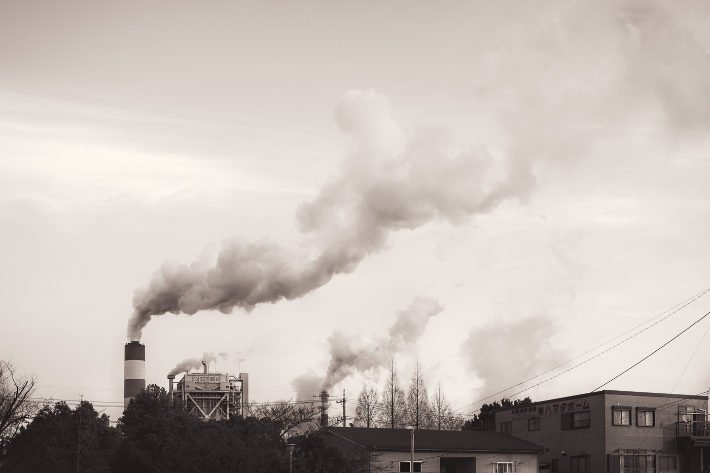
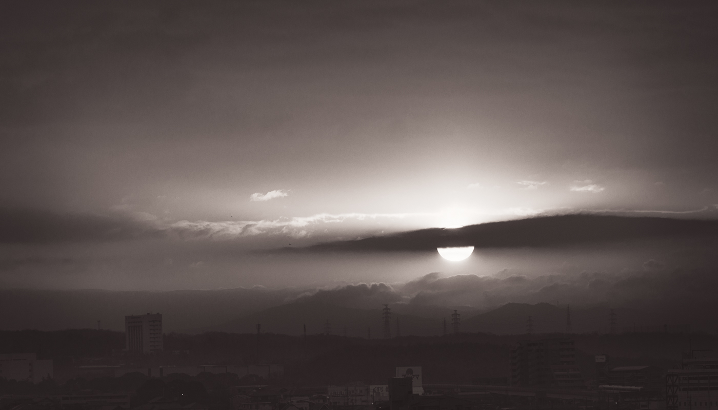
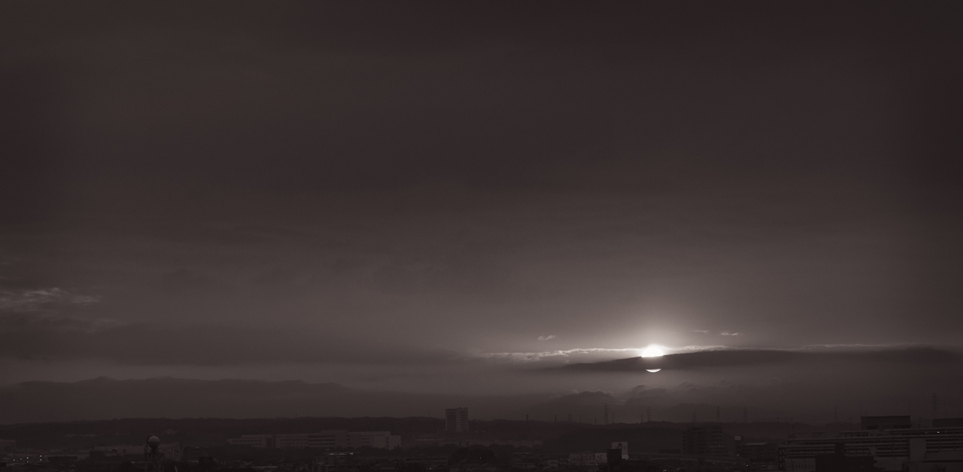
These are a few recent photos that I have converted to black and white. In the case of the smokestacks, I set off on my bike to photograph them in the early morning, when the cold air makes the steam show up more dramatically, knowing ahead of time that I would convert them to black and white. I'd seen the smokestacks on previous rides and had an image in my head ahead of time. In the case of the steaming bowl of miso soup, the original color version had an orangish cast that I thought didn't add to the composition. With the sunset photos, it was the colors that originally caught my eye, but after viewing them on the computer screen I couldn't get the color contrast I wanted, so I tried black and white and liked the result. Contrast in color and contrast in shades of grey can produce very different effects, and sometimes not what we expect. Of course, everyone has their own opinion, and some may think color would have worked better with these. But, in the end, if you're just taking photos to please others, and get caught up in the quest for "likes" and approval, you may have a hard time discovering and defining your own tastes, and your chances of producing something original will be compromised.
